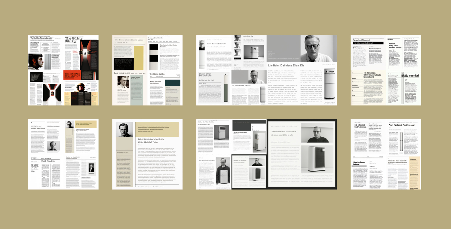
As part of the process of building this website you’re reading (thank you!), I decided to design the site from scratch instead of using a template. I pretty quickly hit a point that can happen where you’re so early in a project and it could truly go in any direction, and I became a bit stumped on the design. At the same time, I’ve been playing around with generative AI tools like Midjourney. So, I tried using Midjourney to find inspiration.
First, I asked what a blog designed by Stanley Kubrick would’ve looked like.
Minimalist two column blog layout designed by Stanley Kubrick, 2001: A Space Odyssey --v 4 --uplightOne minute later, it responded with this:
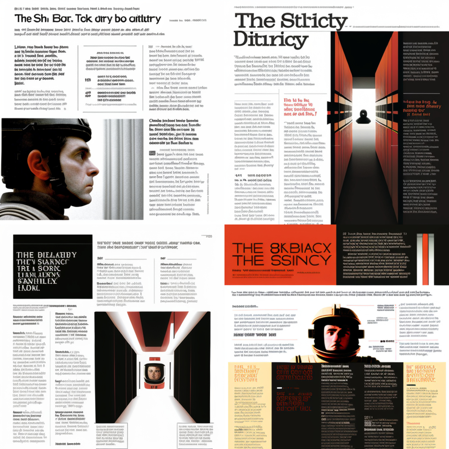
It went with more of a magazine layout, but still, it made some interesting color, typographic, and compositional choices.
simple elegant minimalist two column blog design, designed by Paul Rand, 1950s --v 4 --uplight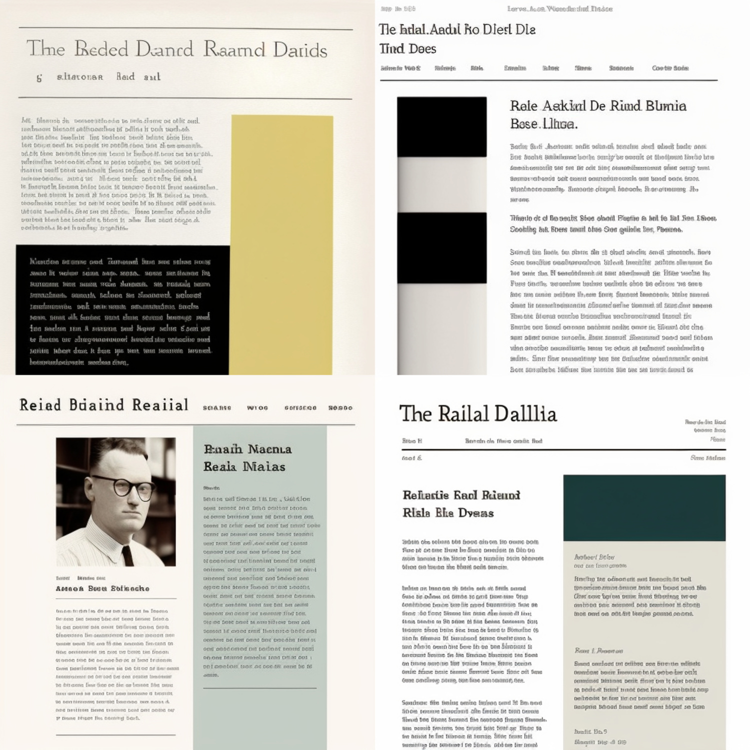
simple minimalist two column blog design, designed by the MTA, standards manual, 1970s --v 4 --uplight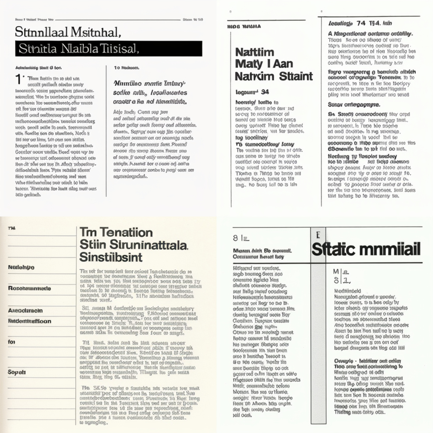
I then asked what a blog designed by Dieter Rams would’ve looked like.
Minimalist two column blog layout designed by Dieter Rams, 1950s, simple --v 4 --uplight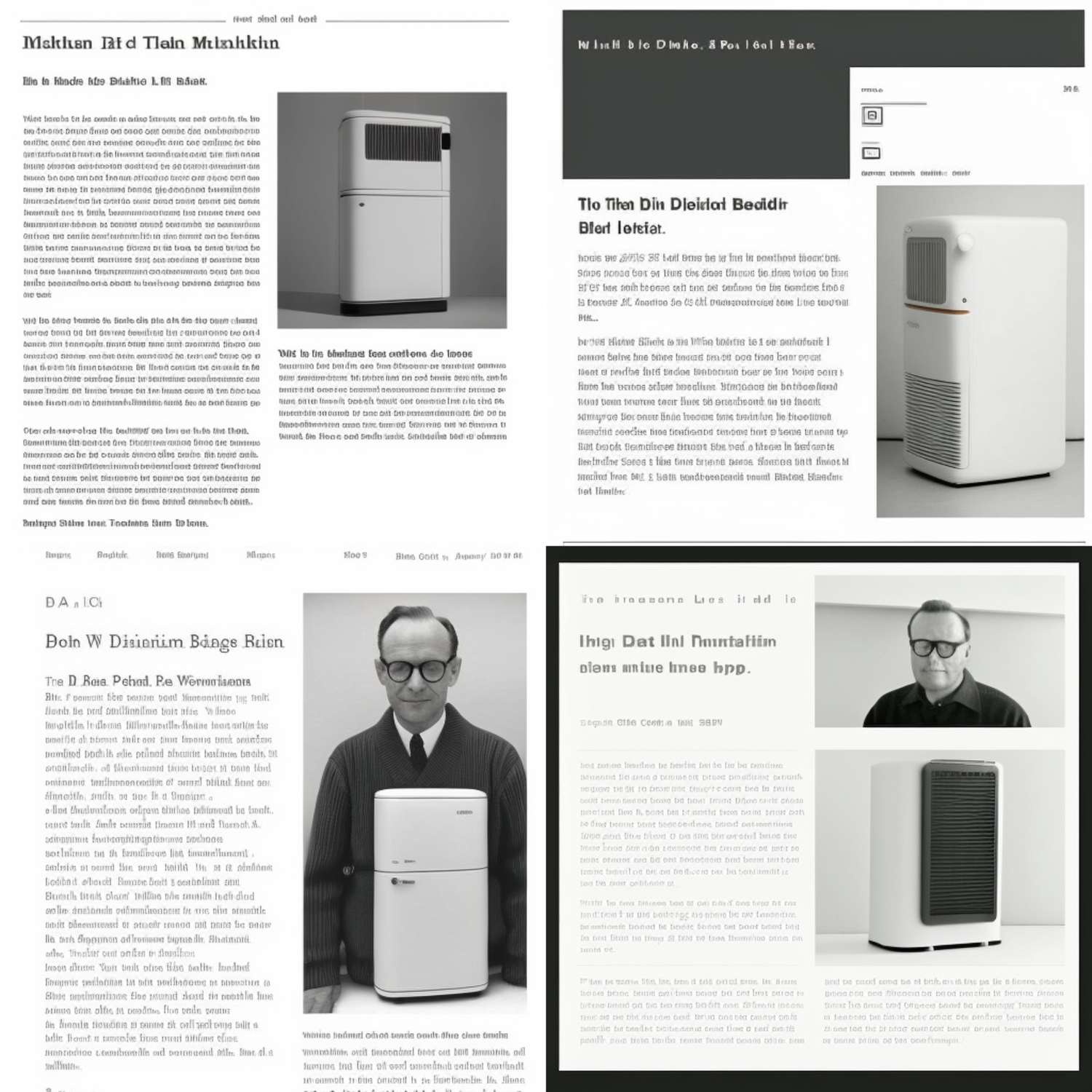
I asked it to upscale the 4th in the grid:
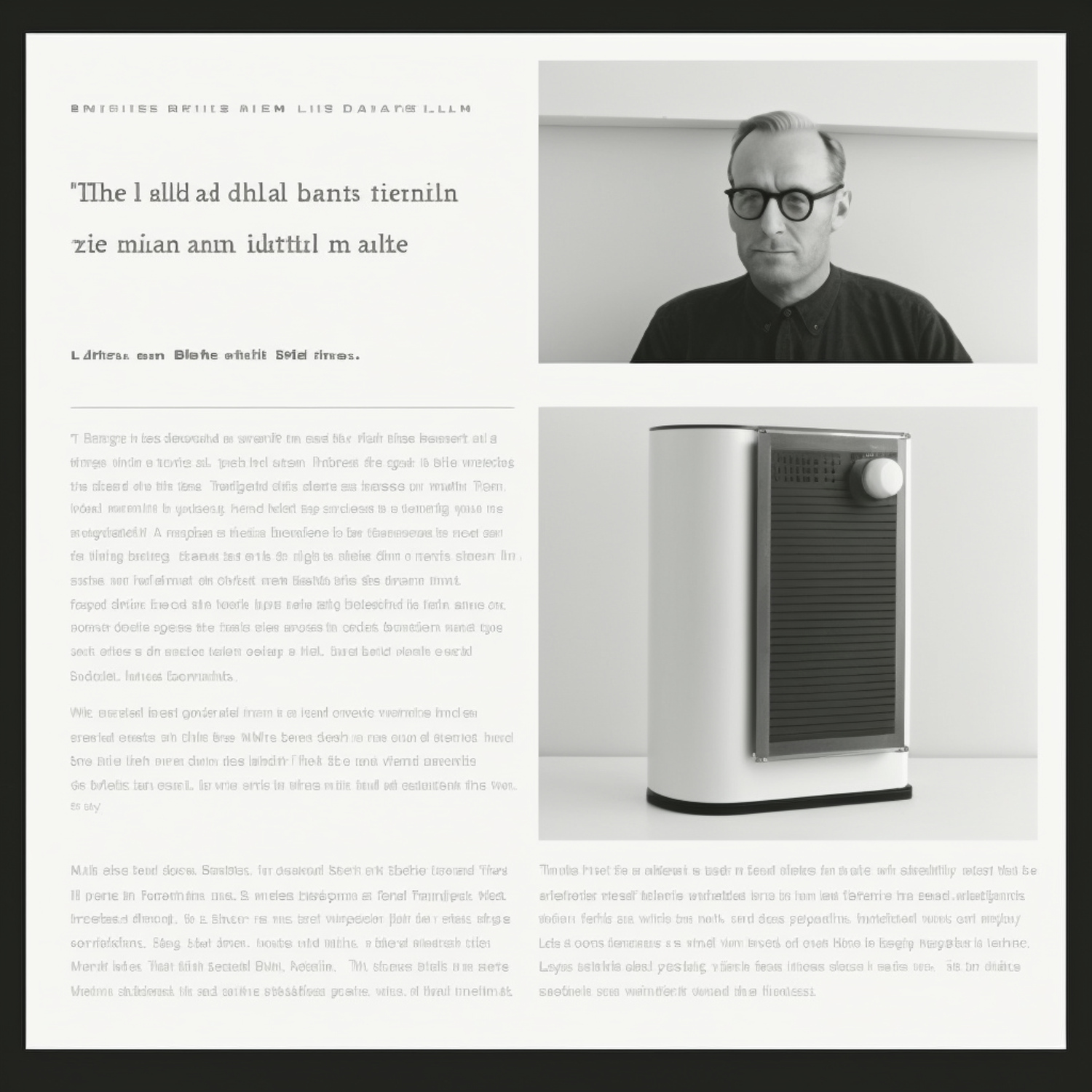
That’s a nice, sparse, elegant layout - much like the work of Dieter Rams. The layouts that Midjourney came up with were more like what you would find in a magazine, which makes sense: there are probably more magazines in the training data than website screenshots. Either way, I found the resulting images interesting, and this last image in particular got me thinking about applying a grid pattern to my own design.
When I hit a creative block, an AI-generated layout was the spark I needed to get unblocked and find a direction I was happy with. Where this website design ended up is different from what the AI came up with - that’s the nature of the creative process. Had I continued to only look at websites like Medium and Substack, I probably would’ve ended up with something more conventional.
Other Applications
Today’s generative tools are good for rapid concepting, not for crafting finished work. For now, it still takes a human to refine that rough draft into something polished and production-ready. UI designers can use Midjourney to explore different visual directions for a website they’re working on. It’s a different experience from going to, say, Dribbble for inspiration.
I also wouldn’t be surprised if art directors, creative teams, professional movie production studios were already using Midjourney to quickly iterate on and find the perfect style or imagery for a shot, a scene, or a film. An entire film can stem from a single image or visual idea. That is where a tool like Midjourney shines.
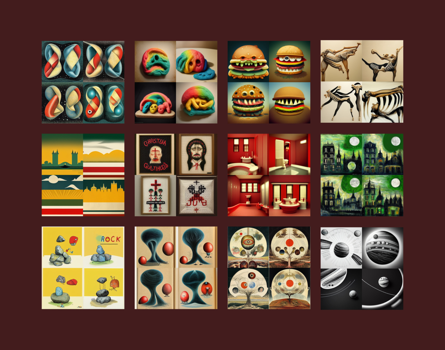
It will be really interesting once generative AI starts to produce actual text instead of gibberish. Given the current rate of progress, I wouldn’t be surprised to see actual text in AI-generated images within the next year or two.
Using the tool in this way also I think avoids issues around supporting creators, which I’ll explore in another article.
